Media One
- Art Direction
- UI Design
How to craft a gorgeous UI with a naive project flaw
Release year: 2016 • 1 min read
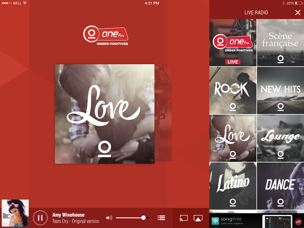
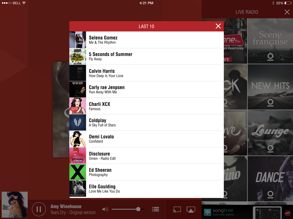
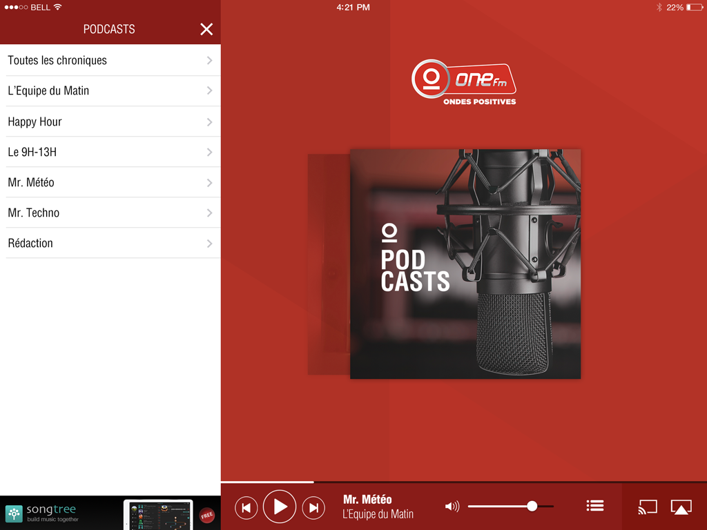
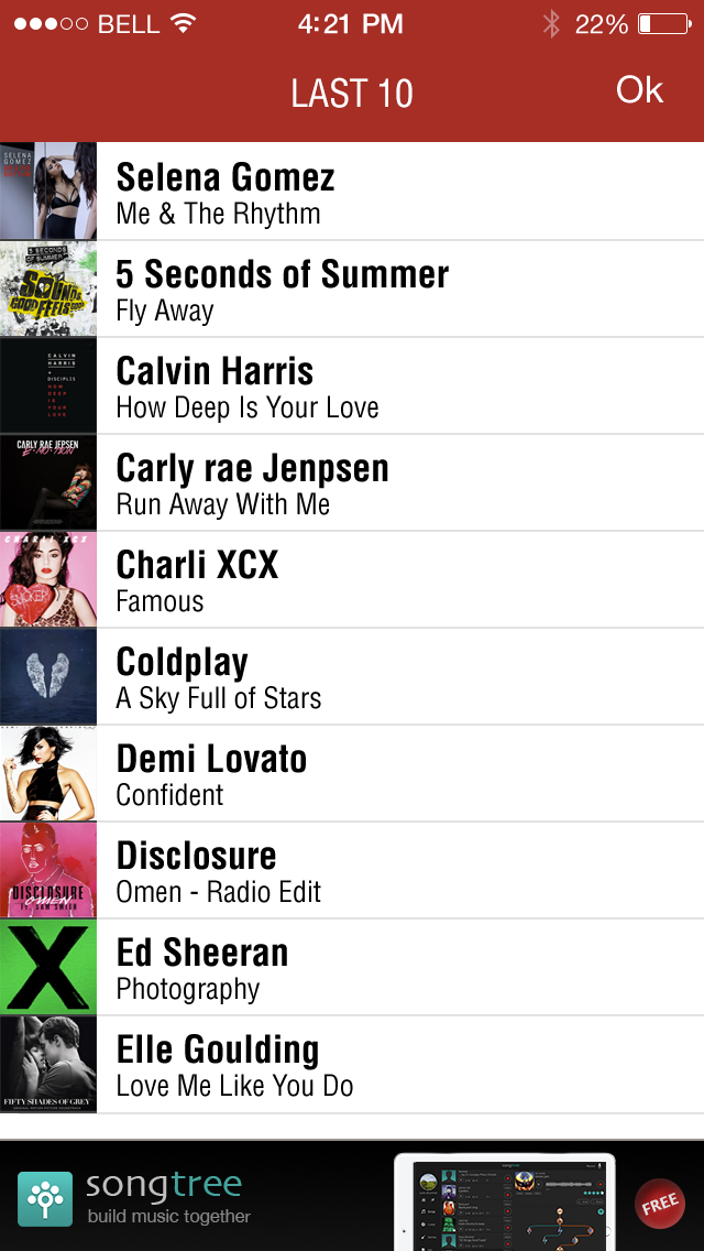
Developed for the swiss radio station One FM, the app allows the user to access podcasts and thematic channels of the station by live stream.
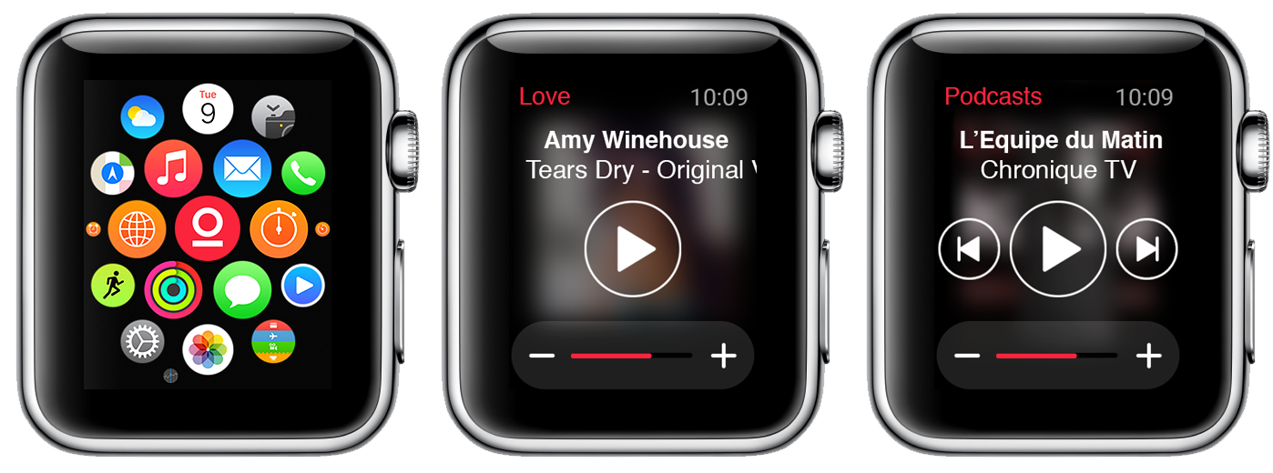
Pioneer project with extension for Apple Watch, integrated to iPhone app to execute commands of radio control and channel change.
iPad
iPhone
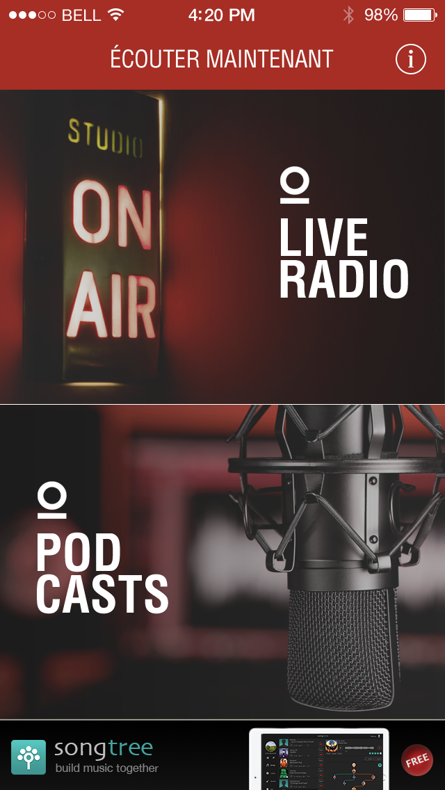
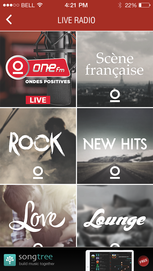
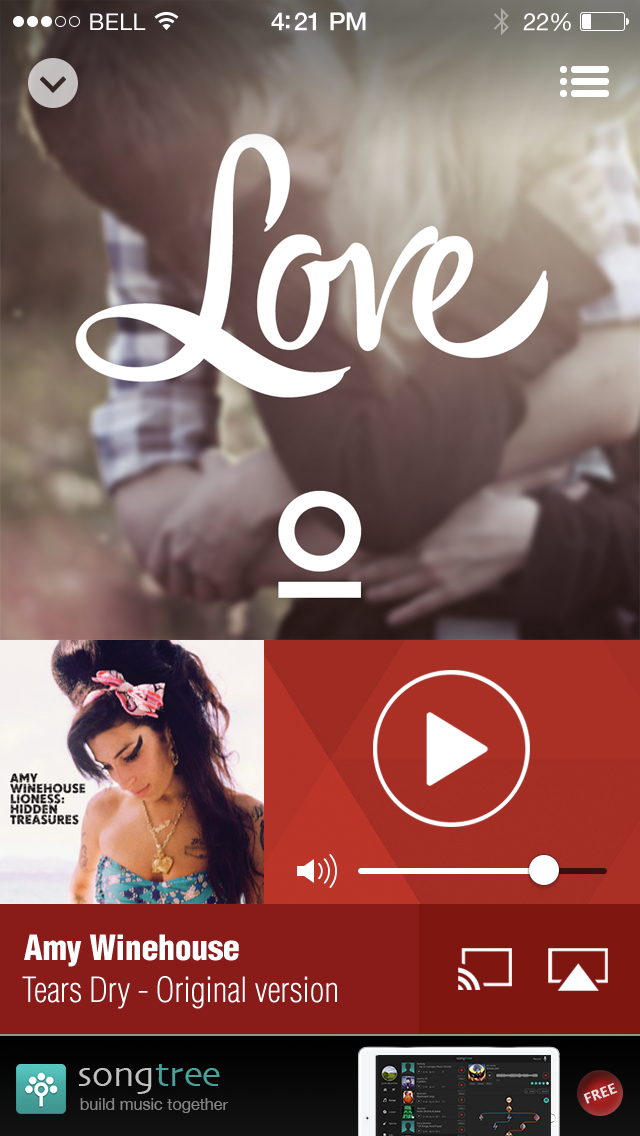
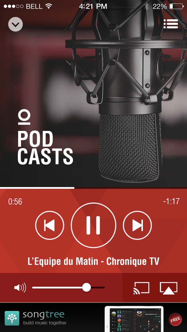
Looks pretty and neat.
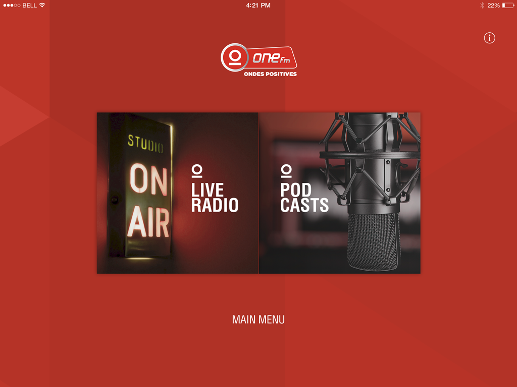
But there's a big catch. The home screen wasn't designed with new types of content in mind.
Furthermore, without realizing it, I ended up adding an unnecessary step in the flow to access the content.
Not to mention, I didn't think about suggesting widgets to facilitate quick access to a channel's livestream that perhaps needed better showcasing or was the most popular channel.
I took a while to convince myself of that all. What I was doing started to make no longer sense for me.
Luckily or unluckily, the product was approved and launched as is.
That was one of the last projects where I focused more on the beauty of the interface and its transitions, ignoring the real objectives a project should meet.
It was another clue I picked up to move away from being a UI Designer and transition into Product Designer. As a mostly solitary UI designer, I often risked falling in love with my own art, even getting into ugly fights with developers.
These days, I don't run that silly risk anymore. I've come to see greater beauty in meeting business objectives and surpassing them to create new goals ahead.
I don't want to just be a problem solver. I want to also be a creator of good problems.
